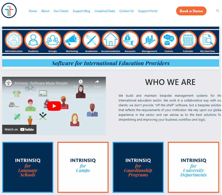
A quick look at the new Intrinsiq website and at first glance you’ll immediately notice how different it looks. We wanted the website to reflect the kind of company we are and for that reason we chose to have something that looks contemporary, yet professional and clear.
One of the things that immediately strikes you upon landing on our website are the tabs. Apart from the general tabs, such as the ‘About us’ section, this new website also includes two very important areas - the ‘Support Blog’ section and the ‘Graphical Data’ section.
We share weekly content with our readers and followers through our blog, and, in case you haven’t seen it yet, here’s what our blogs focus on. We mainly have four blog posts that we share with our readers on a monthly basis:
This section focuses entirely on giving our users and readers a step-by-step guide on how to use various aspects of Intrinsiq. In this section we look at features such as Correspondence, Diary Entries, Paperless Attendance and Class Allocation, among many others. The main difference between the blog section and the graphical data section is that in the first one we communicate our message and give our explanation through text, whereas in the second option the explanation is more visual through graphics and design. That way the step-by-step process that you will need to undertake in order to get a particular feature to work becomes much more visual, and hence clearer.
In this article we merely touch upon the main features of the website, however, in the coming weeks we’ll be going into more detail. Do you like what you see? Get in touch with us on [email protected] to give us your feedback!


2025 SchoolsandAgents (C) - Developed by Websuccess